Design Strategy
Information Architecture Vision
Introduction
From our work on the Contact Center Vision project, we realized that the biggest priority for a revamp was the information architecture. We needed to tidy things up by de-duplicating content and creating a clearer structure to bring all the important pages together. Plus, we wanted to add more specific pages to cover key areas. Our aim was to make it easier for users to find what they need by grouping related pages and giving them the option to customize their own views.
My Role
As a UX Manager, I focused on giving clear, actionable feedback throughout information architecture projects. I worked closely with the my team to ensure that navigation, content structure, and the overall user experience aligned with both user needs and business goals. My role was to help refine and guide the process so the final result was intuitive and scalable.
I was also responsible for presenting our progress and key decisions to stakeholders, including executives. I broke down complex IA concepts into simple, understandable ideas to ensure everyone was on the same page. It was all about getting buy-in, addressing concerns, and making sure the project delivered real value for both the users and the business.
Objective
Our main goals for the IA redesign were to simplify navigation, improve how easily users can find content, and enhance overall user satisfaction. We wanted to make the experience as smooth and intuitive as possible for all kinds of administrators. We decided to tackle the information architecture because of our user interviews we conducted when we did our vision work.

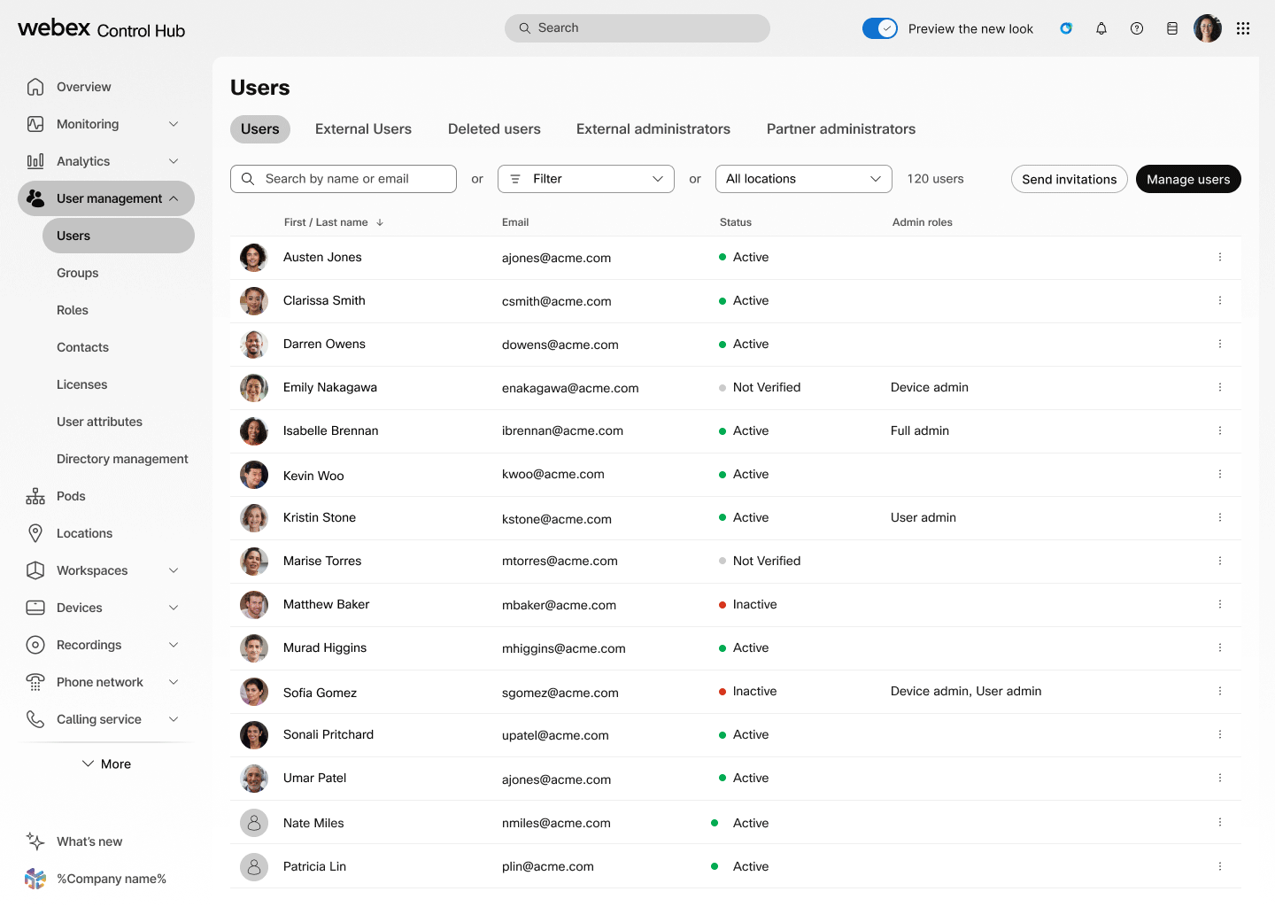
Current Information architecture
We were trying to tackle four main issues with the old information architecture:
-
Scalability Problems: The current IA is too flat and doesn’t scale well as we add more complex offerings. It works for now, but it quickly becomes messy when we try to grow.
-
Confusing for Multi-Service Admins: There’s a lot of duplication in the current setup, especially for admins managing multiple services. They end up seeing the same areas repeated, which adds to the confusion and makes it harder to navigate.
-
Stuck in Service Silos: The IA organizes everything by service, which is an issue when different services have overlapping features. You end up with duplicate sections that have the same page names, which doesn’t help anyone.
-
CX Tier Upsell Challenges: With the current structure, it’s almost impossible to create a clear upsell path for customer experience tiers, because the navigation is too confusing to guide users through that process smoothly.
New Information Architecture

Our main goals for the IA redesign were to make navigation simpler, help users find content more easily, and improve overall satisfaction. We wanted the experience to feel smooth and intuitive for all types of admins. To do this, we made the IA more scalable and collapsible, which helps cut down on cognitive overload. Instead of organizing by service, we grouped things by feature, so there’s no more duplication—just one feature that can apply across services. We also added a lot of customization options, which I’ll dive into next.
Favoriting
Since our admins have different roles and manage various services, it made sense to let them tailor their own experience. If an admin frequently uses a specific page, they can easily reorder it to prioritize what’s most important to them.